All You Need To Know About The Popular Colors For 2018
Pantone has named Ultra-Violet, a blue-based purple, the 2018 color of the year. Leatrice Eiseman, the Executive Director of the Pantone Color Institute states, “that we are living in a time of that requires inventiveness and imagination. It is this type of creative, inspiration that is indigenous to Pantone 18-3838 Ultra-Violet that takes our awareness and potential to a higher level. From exploring new technologies and the greater galaxy, to artistic expression and spiritual reflection, intuitive Ultra-Violet lights the way to what is yet to come.” Office interiors will be sure to see accents of the color of the year in 2018.
Pantone also released their trend palettes for the new year and there is something for everyone.
Which color palette is right for your business?
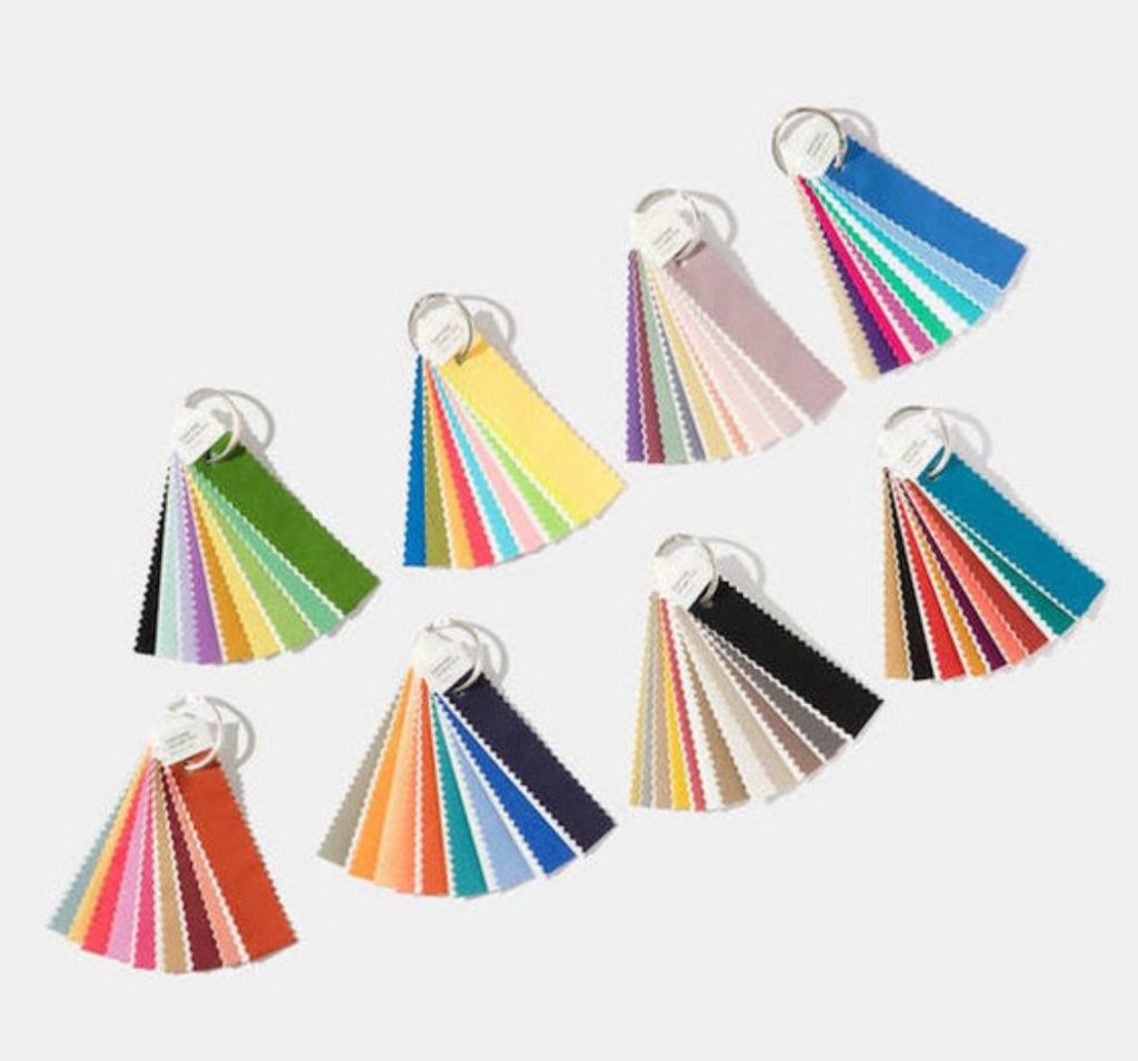
VERDURE
With colors that are vegetable-inspired, Eiseman has described this palette as “symbolic of health.” This color group includes colors like Celery and Foliage, purples and eggshell blue.
PLAYFUL
With colors like Minion Yellow, Green Flash and Blue Skydiver, this palette has bold and fun colors that might make the perfect accent colors in your workspace.
DISCRETION
The color grouping that is understated and subtle, it is nostalgic and professional. Including colors like Elderberry, Burnished Lilac and Hawthorne Rose, it will provide your business with a discrete and refined amount of color to your office.
TECH-NIQUE
To stress the presence of technology in our lives, Pantone has included a color grouping that is a burst of lively and bold colors. Including colors like vibrant blue, green, fuchsia, purple, turquoise, and hot pink with colors like brilliant white and frosted almond to offset the pops of color.
FAR-FETCHED
A palette that embraces many different cultures, far-fetched features colors like iced coffee and ruby wine, these colors will represent the unique and diverse culture of your workplace.
RESOURCEFUL
If you have a lively brand, resourceful is the color grouping for you. Featuring bold shades of orange and blue, it will express your innovative and creative culture.
INTRICACY
This color grouping expresses the popularity of intricate designs. Metallics abound with colors like holly berry red and yellow sulfur. Many designers consider these metallic colors the new neutrals.
Because each color that Pantone includes in their trending palettes encompasses something about fashion, decorating or design, all of these colors including the color of the year will have a dramatic effect on office design. Are you ready to incorporate new colors into your space?
PHOTOGRAPHY BY: PANTONE
Top row: Verdure, Playful, Discretion, TECH-nique. Bottom row: Far-Fetched, Resourceful, Intricacy, Intensity

