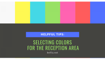
Helpful Tips: Selecting Colors for the Reception Area
Because your reception area is the first point of contact clients and receives the most foot traffic from clients and employees alike, it is important that it’s design is welcoming, tells your story and immediately conveys who you are as a brand and a company. A great place to start when creating a positive feeling for all who walk through your doors is through color.
When considering a shade of color for your reception area, it really is important to consider the way you want people to feel. If it is welcoming and cheerful, a muted shade of orange, such as peach or another warm color is perfect. Yellows create a feeling of cheerfulness. Calming colors are blues/greens. Here is a little bit more information about colors and the feelings they evoke:
Blue/Green
Because these colors are found in nature, blue and green hues have a calming effect. Not only do blues and green create a calmer atmosphere, but they also improve efficiency, focus and create a sense of wellbeing for employees. Adding plants to your space is a great way to incorporate green into your space. Research has shown that there is a definitive link between the color green and increases in creativity.
Red/Orange
While most businesses are not going to choose to paint their entire office red (or orange), using these colors as accents can be highly impactful. Because these colors are active and intense, they increase energy. It is important to use to use them sparingly, because too much of an intense color can create stress and aggression in employees. Experts suggest using splashes of these colors in areas where employees which are not primary work areas like kitchens, hallways and even bathrooms.
Yellow
Yellow has long been associated with optimism, happiness and cheerfulness. But like red/orange, it is best to use yellow sparingly because of its intensity. Painting an entire room yellow can actually induce stress and agitation. By using yellow on accents walls or furniture, you can trigger innovation, creativity and energy in your employees. Bold colors, such as yellow, are often good colors to include with other muted shades in your logo, because they tend to draw the eye towards them.
Neutral Colors
Neutral colors have their place alongside brighter colors, they will often compliment other colors in your design scheme. Alone they are not particularly energizing or stimulating, but alongside bold colors they can create depth in your workplace design.
Ready to make a change to your reception area? Give Bellia a call today and let our experts help!